The British Government’s £750k Full Stop 🇬🇧
Marketing Unfiltered #45 - £750k Logo's!
Good Morning Leaders
Editors Note
This week Harry goes fully unfiltered with his breakdown of the £750k full stop Gov UK logo.
Thanks for the feedback on my the first, the only, the last framework from last week - read it here if you missed it.
If you enjoy MU please hit share below.
🇬🇧 The British Government’s £750k Full Stop 🔴
Nobody ever went broke betting against the commercial acumen of the British government, but their latest wheeze to update the Gov.uk logo and brand design guidelines stretches its ineptitude to new, extraordinarily low chasms.
In 2024, The Government Digital Service announced it had awarded two contracts for a GOV.UK “brand identity refresh” to famed Ad agency M&C Saatchi with a combined value of up to £750,000.
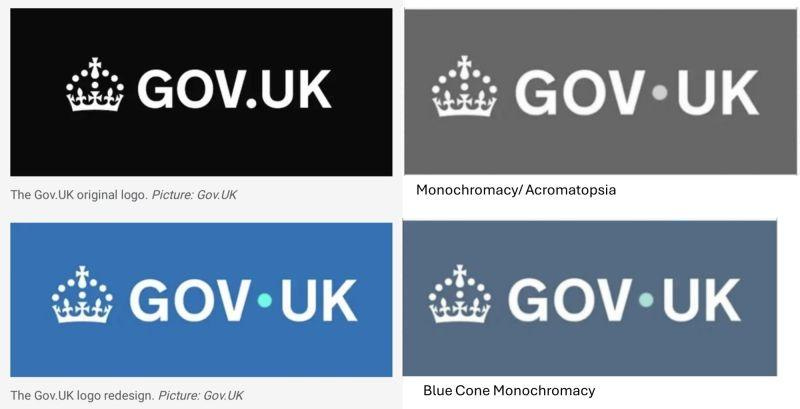
Part one of that project - the 'new' Gov.UK logo - was 'launched' on the 25th of June 2025 and yes, as you’d expect, it’s utterly crap,
The PR supporting the newly refreshed logo would be quite an amusing read, if it were self-aware:-
"The Tudor Crown with GOV.UK written next to it, with a light blue coloured dot up in the middle between GOV and UK on a blue background".
The new logo, barely discernible from the old, is about as cost effective as a timetable on an HS2 station platform.
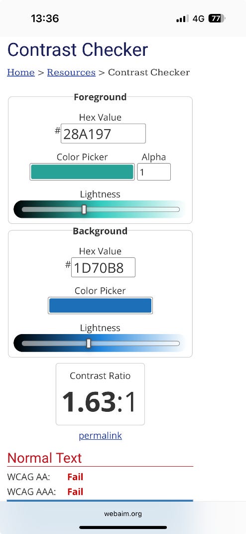
In an ambitious effort to trump other inept government departments, The Digital Service have not only been fiscally irresponsible, but in a rare double header, have broken their own accessibility guidelines, too.
If you look at the Government’s own policy on colour accessibility, it links to a contrast checker tool that allows you to sense check your projects to ensure they meet the minimum criteria for accessibility (thanks to Pascal Olivet of Pasol Interactive for helping me dig into this bit).
This is the test result for the turquoise dot in the new Gov.uk Logo:-
£750k!
The truly unbelievable news is that The Government Digital Service awarded M&C Saatchi a £750k brief for two 'brand identity refresh' projects last year, including this one.
This means they still have £218,000 to spank on part two, which might just be enough to add a redundant full stop or laughing emoji after the logo. Or to take the Government Digital Service brand team out for a few more long lunches in Golden Square, Soho, where, one presumes, this tragic episode was conceived in the first place.
Or perhaps they’ll have a moment of habit breaking clarity and hire four of the UK's many unemployed brand designers at £55k a year to do the job properly?
Don’t hold your breath…
Whilst M&C Saatchi were the (hugely grateful, badly briefed and, one assumes, mildly embarrassed) recipients of the half a million Pound fee to change the Gov.uk logo background colour and move the recoloured, inaccessible dot into a space a URL dot has never been seen before, the ultimate blame for this pathetic episode can’t really be levelled at them.
The Client Signed Off
Both good and bad creative design work starts with a client brief and ends with the client’s sign off. As such, all M&C Saatchi can be accused of is taking advantage of a criminally ill-prepared government Marcoms team, price gouging and failing to have their name surgically removed from this cataclysm of a project before it went live.
Thirty years ago, Saatchi & Saatchi (the agency from which M&C Saatchi was born) created a hugely impactful political campaign showing a dole queue outside an employment office with the headline ‘Labour isn't working’.
It seems to be working pretty well for them, now.
Hire Or Fire…
One day, those responsible for government Marcoms will hire someone credible to lead these kinds of briefs. Once they've recovered from the heart attack induced by their audit of its previous work, you could expect to see proper marketing, communications and design delivered at a fraction of the cost. But that time is not now, and a litany of evidence suggests such pragmatism and expertise won’t arrive in the corridors of power for a while.
As it stands, the Gov.UK brand refresh is yet another example of ‘Emperor’s New Clothes’ fiscal irresponsibility delivered by another lacklustre government department - except this Emperor was given a barely visible blue G-String costing the taxpayer three quarters of a million quid.
If you’re curious as to how it could have been better spent, that fee would cover the salary (with a long overdue and well deserved pay rise) of twenty nurses.
Harry Lang is a CMO, Managing Director of marketing consultancy Brand Architects and author of the 5 Star rated marketing guidebook ‘Brands, Bandwagons & Bullshit,’ available on Amazon. You can connect with Harry on LinkedIn or email him at Harry@BrandArchitects.co.uk.
» Agree or Disagree? Tell Harry and I what you thought below
Have a great end to your week and we will land in your inbox again next week
Danny Denhard (& Harry Lang)
PS I have a new AI podcast called AI Moment, it’s for leaders and execs wanting to understand AI in 8 minute podcasts.


